Tutorial
Introduction
In this section, I will show you how to make a one-page website Reen step-by-step using Rocket. The PSD file can be found here.
Initial
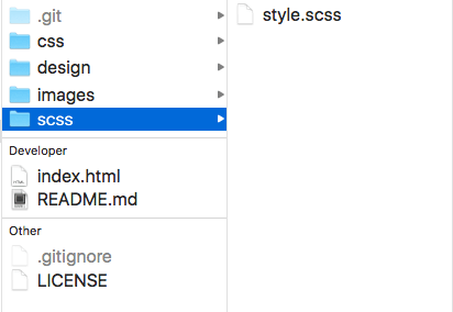
Create a folder rocket-reen/ and sub folders scss/, css/, images/ to contain style sheet and images. Now the folder structure looks like this:
Download rocket
Download Rocket using bower:
Open the command line tool, change directory to rocket-reen/, type bower install rocket and enter. (I have bower preinstalled in my computer.)
Now my folder structure will looks like this:
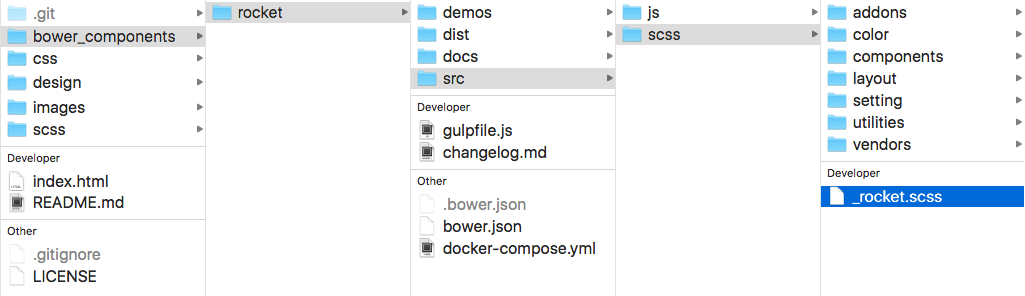
Notice that a new folder bower_components/ was created. Find _rocket.scss file inside it which we need to @import in the next step.
Import rocket
@import Rocket in the style.scss file.
@import "../bower_components/rocket/src/scss/rocket";
Task runner
Now I will use a task runner to compile our scss file to css file automatically. I will use gulp, but you can use other tools.
Open command line tool, type npm init gulp gulp-sass gulp-sourcemaps browser-sync and enter. This will install the packages we need to run a local server (browser-sync) and compile our scss file to css file (gulp-sass). (I have npm preinstalled on my computer.)
Create a new file gulpfile.js in the root folder and add the following code:
const gulp = require('gulp');
const libsass = require('gulp-sass');
const browserSync = require('browser-sync').create();
const sourcemaps = require('gulp-sourcemaps');

// SASS Task
gulp.task('sass', function () {
  return gulp.src('scss/*.scss')
      .pipe(sourcemaps.init())
      .pipe(libsass({
        outputStyle: 'compressed',
        precision: 7
      }).on('error', libsass.logError))
      .pipe(sourcemaps.write('../sourcemaps'))
      .pipe(gulp.dest('css'))
      .pipe(browserSync.stream());
});

// SERVER Task
gulp.task('browserSync', function() {
  browserSync.init({
    server: {
      baseDir: './'
    },
    open: true,
    notify: false
  });
});

// WATCH Task
gulp.task('watch', function () {
  gulp.watch('scss/*.scss', ['sass']);
  gulp.watch('*.html').on('change', browserSync.reload);
});

// Default Task
gulp.task('default', [
  'sass',
  'browserSync',
  'watch',
]);
Notice that I added a watch task which will re-compile our scss file and refresh the browser whenever I change the scss file.
Now open command line tool, type gulp and enter. This will start scss and watch tasks and open a new tab (or new window if the browser didn't open yet) in the default browser.
Assets
Now let's add the images, icons (use icon-font generated at fontello) and text in the index.html file. I added some reset styles as well. Now the page looks like this.
Add container
Notice the design is based on a 12 columns grid, the main content is 1170px wide, gutter between columns is 30px wide.
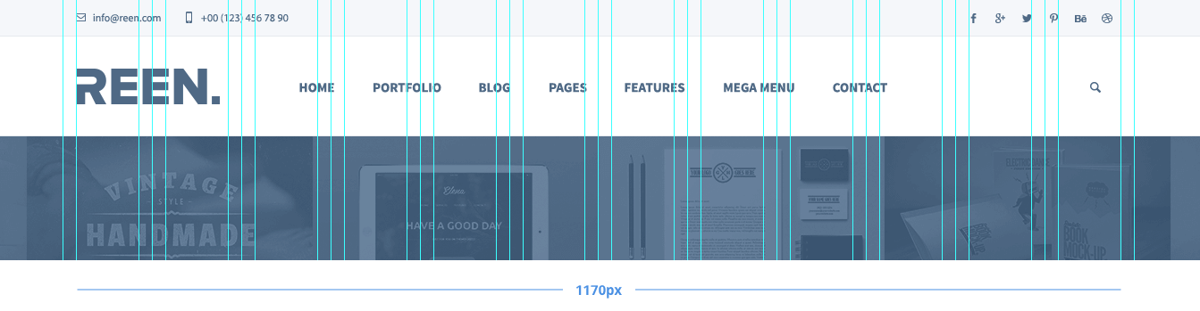
Let's first set up the container width and gutter use variable $ro-layout in style.scss.
$ro-layout: (
  container: 1170px,
  gutter: 30px,
);
Now let's add a .container to constrain the main content.
.container { @include container(); }
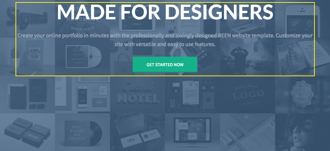
<section class="hero">
<div class="container"><!-- add .container -->
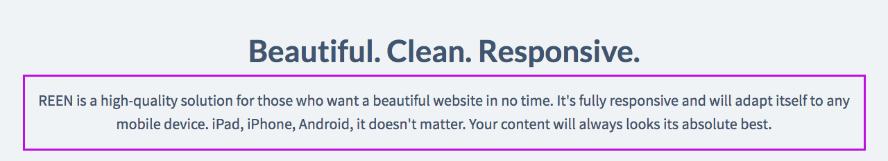
<h2>Made for Designers</h2>
<p>Create your online portfolio in minutes with the professionally and lovingly designed REEN website template. Customize your site with versatile and easy to use features.</p>
<div><a class="btn btn--bg" href="">Get started now</a></div>
</div>
</section>
All the content is now constrain to 1170px and the container box is center aligned. View the page.
Add basic styles
After add more styles, the page looks much closer to the design.
If you look at the style.scss file, you will notice I used a shorthand mixin type to create type styles and a function contrast to get a contrast color automatically based on the background.
$lato: '"Lato", sans-serif';
$color-secondary: #16B18A;

.heading1 { @include type(78px uppercase $lato); }
.heading2 { @include type(44px $lato); }
.sub-heading { @include type(22px 1.55); }
.btn {
  @include type(15px uppercase '"Source Sans Pro", sans-serif');
  // ...
  color: contrast($color-secondary);
  background-color: $color-secondary;
  // ...
}
Still there are some layout issues left, let's look at them one-by-one.
Center layout
First we need to make the introduction content center aligned vertically and horizontally. Use mixin center in this case.
<section class="hero">
  <div class="hero-content">
  <!-- <div class="container"> -->
    <h2 class="heading1">Made for Designers</h2>
    <p class="sub-heading">Create your online portfolio in minutes with the professionally and lovingly designed REEN website template. Customize your site with versatile and easy to use features.</p>
    <div><a class="btn btn-bg" href="">Get started now</a></div>
  </div>
</section>
I replace the class .container to .hero-content because I noticed the content didn't occupy the full width of .container.
// hero
.hero {
  @include center();

  // ...
  // other styles
  // ...

  &-content { max-width: 960px; }
}
Then I just add one line of code @include center(); to the .hero and it's done. Now the content is center aligned. View it here.
Inner container
Noitce that the sub headings are too wide compare to original design. Let's add a .inner-container to narrow it.
.inner-container { @include container(50em); }
Replace .container with .inner-container.
<section class="get-in-touch">
  <div class="inner-container">
    <h2 class="heading2">Fresh branding for a creative startup</h2>
    <p class="sub-heading">Magnis modipsae que voloratati andigen daepeditem quiate re porem aut labor. Laceaque quiae sitiorem rest non restibusaes maio es dem tumquam.</p>
    <div><a href="" class="btn btn-md">Get in touch</a></div>
  </div>
</section>
Now the sub headings on the page looks good.
Add gallery
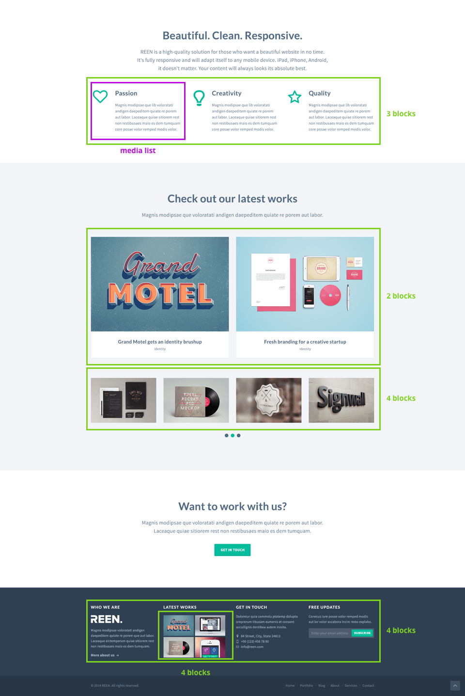
Notice that there are many gallery layouts and media list layouts in the design. We can use mixin gallery and media-list to make it.
$gallery-gutter: 2.56%; // (30px / 1170px)
.gallery {
  &2 { @include gallery(2 gutter $gallery-gutter); }
  &3 { @include gallery(3 gutter $gallery-gutter); }
  &4 { @include gallery(4 gutter $gallery-gutter); }
}
[class*="gallery"] img {
  display: block;
  width: 100%;
}

// features
.features {
  [class*="icon-"] { @include media-list('media' 20px); }
  .media-body { @include media-list('media-body'); }
}
Add related class names to the markup and we're done. View the final page.
The demo code is available here. You can check each step by the commit history. Further questions or issues regarding this tutorial please submit it here.